Re-imagining 50 year old publication as a digital artifact
Turning a panflet into a personalised calendar not losing sight of all the traditional details
Tradition meets digital
I took on the challenge of reimagining Borda D'Água, a beloved yearly publication rich with tradition and history, into a digital experience for an iPhone app. Published since 1929, Borda D'Água offers diverse content for a wide audience, covering astrology, lunar phases, tides, agricultural tips, markets, holidays, and more.

Problem and Challenge
The design challenge was to preserve the publication's iconic traditional elements — such as its old illustrations, compact format, textured feel, and uncut pages — while creating a modern, user-friendly digital experience. Capturing the essence of its nearly century-old identity while addressing the needs of contemporary users required a deep appreciation of its heritage and an innovative design approach.
This project was a theoretical exercise, completed within four days, and stands as a testament to the balance of tradition and modernity in UX design.
Desk Research: Usage and Audiences
To begin the redesign, I prioritized the content, as form should follow function. I started by deconstructing the printed publication, sketching its content on paper to create a clear visual outline. This process helped me break down the material into distinct sections, paving the way for a format optimized for digital use.
Why should every user navigate through fairs or horoscopes if they're only interested in agricultural tips? With such information, the app needed to adapt to user preferences and make navigation intuitive. This concept of personalization became the cornerstone of my redesign while preserving the charm of Borda D'Água.
The same publication serves different purposes for different people — from sea-level timetables to those seeking agricultural tips, horoscope readings, or local market details.
This observation shaped the vision for the app: the ability to tailor their calendar to individual interests.


Moving to Info Architecture
An effective Information Architecture was crucial for the project which is why I designed a system where personalization based on interests would be the initial way to filter information on the app. It's essentially the same as before, but more user-friendly and tailored to your needs. This will save time for users in the future, while still providing access to all information at any given time.

An informed Information Architecture was the key to the project. I've created a concept where personalization by interest would be the first layer for filtering information on the app.
Breaking up content by fine-tuning interests
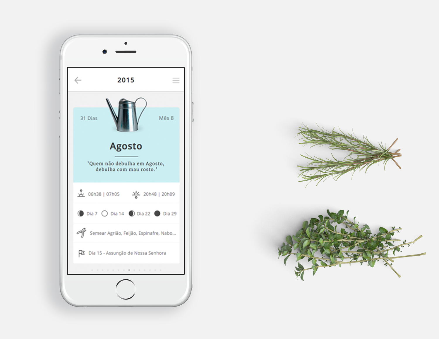
The Borda D'Água app has two levels of information. The first level is a scroll of monthly cards that show your personalized areas of interest. The second level is the inside screen, which displays all the monthly happenings in a day-by-day view similar to the printed version. You can use the search bar to find something specific, or you can use the menu to navigate.
Identity and Visual Choices: Maintaining Tradition
The visual design includes a modern and neutral sans-serif typeface for contrast, as well as a serif typeface that resembles what we see in the publication.
The icons chosen represent different themes and serve as visual markers throughout the app.
The color palette deliberately consists of gray, white, and red, as the red color is used to distinguish original versions from fake ones on the front page.
